|

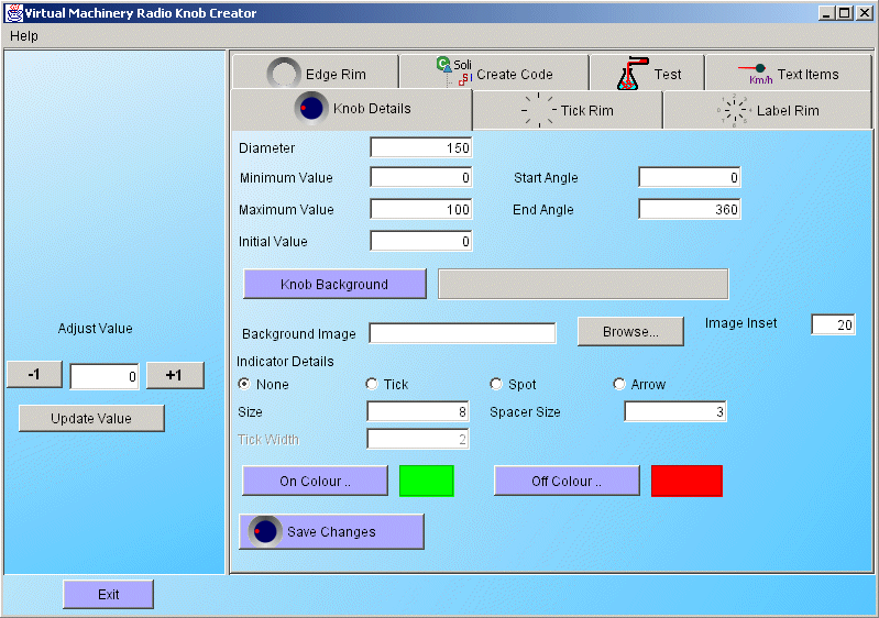
When you first start up the Radio Knob Creation application you will see the screen above which has a number of tabs each of which contributes to the appearance of the Radio Knob indicator widgets created by the application. Some of these are specific to the creation of Radio Knob widgets and are covered in this document. Others are common to a number of the applications and are covered in other places. The tabs in the Knob creator application are listed below - follow the links to find out more about each of these tabs and how they can help you create the radio knob style widget that you want.
The Radio Knob details panel
The details panel is responsible for setting those parameters specifically relating to radio knobs and allows you to adjust the following parameters -
- The Diameter - the overall diameter of the widget
- The minimum value - The minimum value that can be set by the knob
- The maximum value - The maximum value that can be set by the knob
- The initial value - The initial value displayed by the knob when it is first shown.
- The start angle - The angle that represents the minimum value in the knobs range
- The end angle - The angle that represents the maximum value in the knobs range
- The knob background colour - the background colour of the knob
- The filename of the background image
- The inset of the background image (in pixels). See here for details on how to use this feature
- The indicator type (none, tick, spot, arrow)
- The indicator size (in pixels)
- The indicator spacer size (in pixels)
- The tick width (if its a tick)
- The on colour
- The off colour
When you are finished editing these details you can save them by clicking the save changes button and the knob in the illustrative panel will be updated to reflect the changes.
|


