|
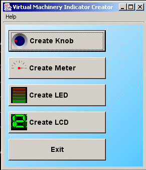 When you first start up the Virtual Machinery Indicator Creation application you will see the screen on the left which offers individual creation applications for each of the Knob, Meter and LED bar indicator widgets.
You can find out more about each of the applications by following the links below -
The individual applications differ according to the type of widget you are creating but they have some common features which are described in the sections below.
The main screen is divided in two with one part holding an instance of the particular widget that you are creating (the illustrative panel) and the other holding a set of tabs that allow you to modify the appearance and functionality of the widget (the configuration area). You can move the dividing bar to control the relative size of these areas.
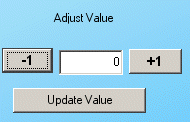 You can test your widget by using the Adjust value sub-panel of the illustrative panel. You can change the status of your indicator by incrementing/decrementing the value using the + and - buttons or by typing a new value in the text box and pressing the Update Value button. For more extensive testing you can use the test tab in the configuration area.
The widget that first appears in the illustrative panel reflects the default settings in the tabs in the configuration area. You can change the settings in each tab and when you save them the widget in the display panel will change to reflect the new settings. In general each tab is connected to a particular feature of the widget that you are creating. In some cases you can remove a feature by pressing a Remove feature button on the tab. Again the removal of the feature will be reflected on the display panel when the changes are saved
When you have decided on a particular design of widget you can then create the necessary code to create that widget in an application. This code will be displayed in the text window of the Create code tab. You can cut and paste this code for use in your application.
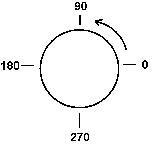
A word about angles
All angles follow the Java convention of starting at 3 oclock and rotating counter clockwise. The image on the right illustrates this.This means that you have to do a bit of calculation to design your widgets but the above diagram should help. Note that values will be calculated as running counter clockwise so if you set your start angle as 180 degrees and your end angle as 0 degrees and your minimum as 0 and maximum as 100 then the zero value will be set at 180 degrees and the maximum at zero degrees. This will ensure that clockwise rotation will increase values and counter-clockwise rotation will decrease them.
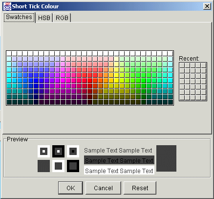 The colour selection panel
Clicking on the button in the colour selection panel will allow you to select colours using the Java Colour chooser. The colour chosen will be reflected in the coloured panel to the right of the button on return from the chooser. The three tabs offer three different ways to select a colour.
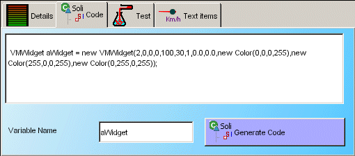 The Generate Code Panel
This panel allows you to generate code which will produce a dial identical to that shown in the illustrative display of the creator. You can set the variable name to be used in the edit beside the Generate code button. To use the code in your application simply select all the code in the text pane by using the pop up menu or the ctrl keys to select and copy the code and then paste it into your editor.
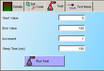 The Test Panel
The test panel allows you to test your generated widget and to see what it looks like in action. You can change four parameters relating to your test - the start value, the end value , the increment at each step and the time delay between each step. Press the Test button and away you go. Remember that if you choose values outside the maximum and minimum values of your indicator these values will not be displayed (all the indicators set values greater than the maximum to the maximum and values less than the minimum to the minimum).
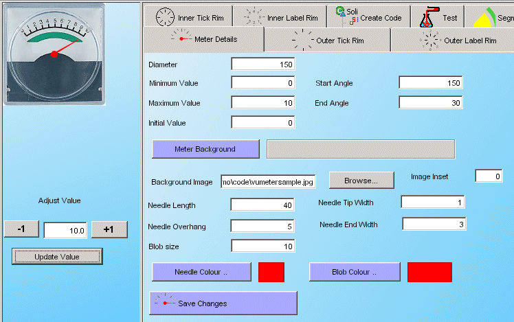 Using Background images
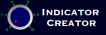
Both radio knob and meter style indicators can use background images rather than recreating the indicator each time. This can improve performance as well as allowing the easy emulation of real life systems. Two images are supplied in the 'code' directory of the distributions - radiodialsample.gif and vumetersample.gif. There are two attributes which can be set in the creator - the name of the file to be used and the number of pixels by which the image is to be inset. The Inset can be used to centre the image. The image to the right gives an example of the settings required to create a meter using one of the sample background images. Note the angles and the scale from zero to 10. You can test this using the test panel.
|